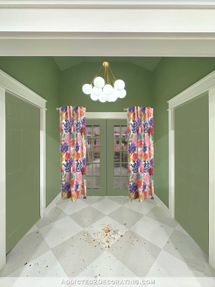
Yesterday, I painted a couple of test colors on the back French doors of the studio, and then I realized that the process of testing different colors would be so much easier if I’d just use my photo editing software. So I thought I’d bring y’all along on this ride so you can see what I saw as I was going through the different test colors.
What’s interesting is that some of the colors I thought would be so nice were an immediate NO the second I saw them. And others that I thought I’d hate actually ended up being some of my favorites.
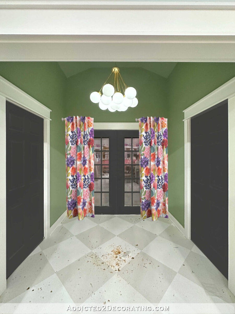
First, let me show y’all the area I’m talking about. This is what the back entry, which is mid-makeover, looks like right now. It has new floor colors/pattern, a new wall color, and a new light color. Now I’m working on narrowing down the new door color because the black looks too harsh to my eye with the new softer green wall color. (That’s gold leaf all over the floor. I still need to do the cleanup from the light project. 😀 )
What makes this back entry a challenge is that there are four doors in this relatively small space. If I were just dealing with the French doors, which are largely glass, I think the viable color options would be much wider. But since I’m dealing not only with the two French doors with lots of glass, but also two solid doors that lead to the half bathroom on the left and the storage closet on the right, some of those options are eliminated because it’s just too much in a small area.
Here are the first two paint colors that I actually tested on the doors. Both are colors that I got from the 72-color paint swatch cabinet. The one on the left is called Tomorrow’s Coral, and the one on the right is called Gumdrops. Gumdrops didn’t really show up, but I thought Tomorrow’s Coral might be nice.

After trying those two on the actual doors, I decided to test out more paint colors with my photo editor. Here’s how those turned out. First up, I tried the Tomorrow’s Coral color that I thought I’d like. Umm…this gave off a real Golden Girls vibe to me. 😀 That’s not quite the look I’m going for.

So I tried a darker peach color called Peach Mimosa. That’s even more Golden Girls than the first one!

Next up, I tried my cabinet color, which is Sherwin Williams Tuberose. That was also an immediate no from me. I love the colors together in this huge room on opposite sides of the room, but I don’t like them right next to each other.

So how about a pale pink? Nope. That just doesn’t do anything for me.

After those few tries, I realized that warm colors just weren’t going to work. So I switched gears completely. I tried a darker version of the green that’s on the walls. I didn’t immediately hate it, so that was an improvement!

I tried carrying the wall color onto the doors. I didn’t hate it, but it also looked a bit bland to me.

Next, I tried the gray in the floor pattern, which is also the gray on the main studio walls, which is Benjamin Moore Classic Gray. I had a hard time getting the color 100% right, but you can use your imagination. And once again, this didn’t really do anything for me.

Then I tried the white on the trim, which was also very hard to get right. That color is Behr Polar Bear. It’s fine, but it’s not anything more than just fine.

Then I tried a random super dark teal. As soon as I saw that, I thought, “Oh, wait! We might be on to something now!” I really liked the striking contrast, but I don’t think a dark teal would work so close to my black framed paint swatch cabinet and the dark charcoal gray vanity in the half bathroom.

Next up, I tried the super dark purple that’s on the buffet in the breakfast room. That color is Behr Sapphire. And once again, I liked it. I didn’t love it, but I thought I was at least heading in the right direction.

Contrary to what I had previously thought, these dark colors were really appealing to me. So the problem with the current color may not be that the doors are dark. The problem may just be that the doors are the deepest pitch black I can buy. But another dark color may work beautifully.
So I tried out a dark gray. This one is called Iron Mountain from Behr. I love it with the floor, but it seemed a bit washed out to me.

I decided to go a touch darker and try out Sherwin Williams Iron Ore. And I actually love this. Iron Ore is not black. It’s like a really dark charcoal, but there is a definite difference between this and the pitch black color I have on the doors now.

It’s amazing to me what a huge difference that slight color difference makes in the overall look. While the saturated black paint color looks harsh to me, this Iron Ore doesn’t look harsh. The less saturated color has a softness to it that I think goes beautifully with the new wall color.
So I’m going to try to stop by Sherwin Williams today and pick up a sample of Iron Ore as well as any other similar colors to try out. I think it’s funny that I kind of went full circle with these colors, and then almost ended up where I started…but not quite. Just that one little tweak makes such a huge difference in the look on edited photos. I’m hoping it’ll have that same dramatic effect on the actual doors in the actual back entry of the studio as well. Because from what I can see, the only other real option is white, and that was just kind of meh for me.
Addicted 2 Decorating is where I share my DIY and decorating journey as I remodel and decorate the 1948 fixer upper that my husband, Matt, and I bought in 2013. Matt has M.S. and is unable to do physical work, so I do the majority of the work on the house by myself. You can learn more about me here.


